Wednesday, May 20, 2009

A kid's bath is not just for kids!

As they flipped on lights to "show off" the kid's/guest bath, the owners just laughed. As you might imagine, this was on the top of their "to do" list! Our main goal was to create a bath that would be exciting for their son and daughter, while maintaining an element of sophistication (since this bath is occasionally used by guests too).

The inspiration for this space came from Mackenzie-Childs. Their use of color, stripes, etc. is bold and exciting..... not childish (which was exactly what we were after here). We gravitated toward the stripe and decided to overhaul the look of the room by adding a faux finish to the vanity (in the form of a stripe- pattern). To further accentuate the stripe we ran it from the vanity over the two VERY important step stools! These step stools became much more than just functional once they were finished... The walls were painted and the room began to feel much larger with a solid (versus the toile) and fresh paint color. In addition to pattern, another important element we altered was the vertical line of the shower curtain. This is easy to do with a custom curtain (and not very expensive). We added height and interest by using a curved shower rod mounted significantly higher than standard. The modifications made to the lighting certainly had great impact too. The polished finish supported our new contemporary style. The placement defined "his" and "hers" vanities, and again, accentuated the vertical line (as we placed them higher than the standard vanity light).

The next time the couple is touring their home with a guest, I hope that when they flip the lights on their response will be a little different!!!

Before


After


Thursday, April 16, 2009

Simplify your Fireplace

Here it is...your typical fireplace mantel... But really, who wants typical?
I can assure you that this couple did not. They wanted a contemporary design that would not compete with the exitsting strong design elements in their family room. The mantel needed to make a statement in the room, but not overpower it.
  • The first picture is the "BEFORE" photo.
  • The second picture is a glimpse at what the sketch process to transform the mantel looked like. There was some "massaging" that occured between this dwg and the final cut. So, if you'd like to make your fireplace mantel look like the one below, DON'T copy the dimensions in this sketch. They have likely been changed a little here and there prior to construction.
  • In the third picture the new mantel is revealed!
  • The fourth and final picture captures a little more of the space. The new sleek fireplace mantel will live very happily in this room! It has a great impact on the space in a very understated way. It draws your attention but doesn't demand it!
Are you ready to change your mantel up? We can help!


Thursday, March 12, 2009

Update your Staircase - The details DO matter!

You walk by it dozens of times a day and have become oblivious to the fact that your staircase needs a face lift! This really is one of the easiest ways to update your home, and it is not that expensive to do (of course it varies based on how large your staircase is...and I wouldn't do it myself). But really, time and time again, people are amazed at the transformation that occurs by simply changing their staircase pickets and potentially adding a few paint details. There are all sorts of styles and finishes of pickets.... the limits truly are endless.
Recently, while meeting with a couple for an initial consultation, we discussed the need to update their staircase. They were very intrigued by the thought, but really had not previously considered it as an option. They loved the idea, and transformed their staircase into a beautiful sleek statement..... Take a look and see for yourself.


Before Photo - Above
After Photos- Below


Having a Vision

Having a vision and going after it is not always easy. Especially if you are looking at some of these before pictures. It is virtually impossible to imagine that some of these vignettes could eventually be full of modern flare and drama! But it wasn't impossible for my clients, S&J. They took me to their newly purchased home, led me to their "dilemna," and explained their vision to me....

S&J cleary wanted a contemporary living area and felt that this space could become just that.....only they weren't sure exactly how. That's what I was there to do. One thing I love to find is a client who is not afraid to push the limits! During this project we pushed the limits and smiled all the way!

For S&J, I was able to design custom built in niches. Talk about drama! We achieved symmetry and balance by the placement, size and shape of the niches. The vaulted ceiling was a feature we loved, because the height of the wall itself was very dramatic. We added a nice contradiction to the vertical lines by placing emphasis on a horizontal trim detail. Adding light and using glass shelves also add a very sexy layer to the wall feature.

Before Photo - Above
After Photo - Below


Before Photo - Above
After Photo - Below


Sunday, February 1, 2009

While you were out....


Before (top photo) & After (bottom)


Before (top photo) & After (bottom)


Before (photo on left) & After (photo on right)

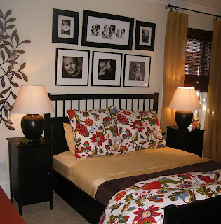
"Can you transform my bedroom while my husband is out of town"? This was the beginning of what I refer to as my "while you were out" project (yes, just like the HGTV show)! You might have watched the show and thought...who really does that? Well, people do!!! There were times we wondered if we were going to really be able to pull it off......but in the end we did! This was a fun and fast paced project. In only a few short days while the Mr. was away, the room was emptied, painted, carpeted, filled with new furniture, bedding, draperies, and much much more! Existing family photos were framed and favorite art and accessories were incorporated to personalize the updated space. I was delighted when I received these words from the the Mr. himself....
"Turning the corner to the bedroom was
like walking
on the scene of a holiday room makeover t.v. show for me. It
is comfortable,
great looking, and really utilizes the space so much
better."
Thanks for giving me the chance to do a "while you were out" room! Who knew it would be so much fun! You guys are great! - G

Wednesday, August 6, 2008

Crazy for Contemporary.....

Most Recent Progress
Before
Progress
Before
Progress
Progress


Love it! Lucky for me, I had the opportunity to create a contemporary living and breakfast area in a great home not to far from mine! It has been very exciting to push the limits with color and style in this open space plan.....which really lent itself to the contemporary style of the owner (I guess that is why they loved the house so much). I love it too! What a great space to entertain in! One of my favorite features is the gallery we created that wrapped around one half of the room in a lime green..... We balanced it with simple but impressive geen draperies on the opposite side of the room. The art is so awesome and adds a lot of impact over the mantle splashing the ink blue we used in the kitchen into the living room. The furniture is versatile, as the pieces can be moved and some adjusted into different types of seating. It is unique space! Enjoy the pictures of the progress. I'll add the final pictures in a few weeks when we hang the draperies in the breakfast room....

Tuesday, August 5, 2008

A New Look Unveiled at the Blue Monkey Bar and Grille, Naples, Florida


I had the pleasure of giving a "face lift" to the interior of a new bar and grille in Naples, FL called the Blue Monkey. By "face lift" I mean changing all the surface materials, lighting, art, millwork, flooring, etc. It is now a great new trendy spot to eat, listen to music, bring your family and just enjoy the atmosphere. It was exciting to be a part of the renovation and even more exciting to experience the Grand Opening and watch people enjoy the new space. If you live in Naples or plan to visit be sure to check out this place....not only am I partial to the decor....but the food and drinks are amazing too.